





Essential Features Every Lip Balm Box Should Include

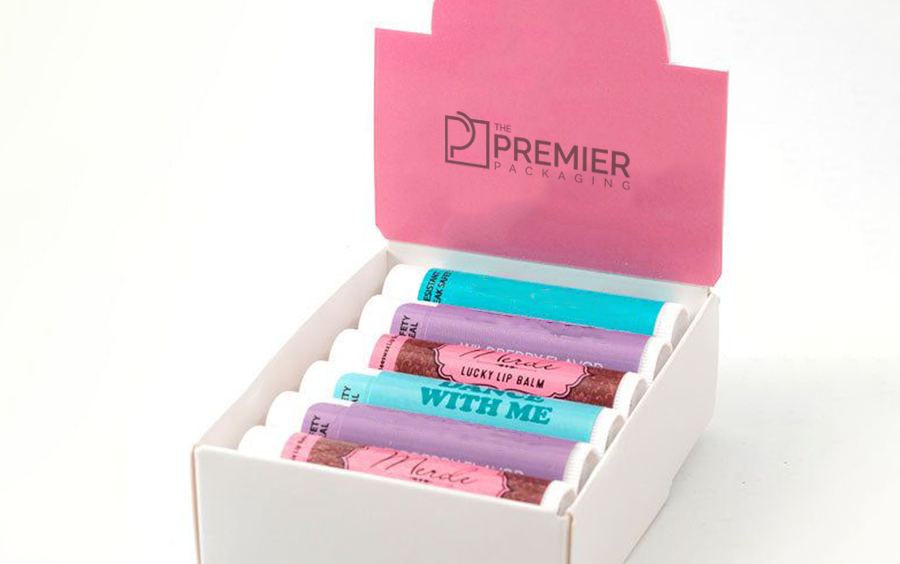
Lip balm is a strange thing to design packaging for. It’s tiny. It’s cheap, at least compared to most cosmetics. And people mostly buy it without thinking too hard, grabbing it near a register or tossing it in a cart alongside something else they actually came in for. None of that leaves much room for the packaging to work with. There’s no weeks-long research phase to win someone over. A box gets maybe two or three seconds sitting on a counter before somebody decides yes or no.
So what actually makes that short window count? A few things keep showing up once you start paying attention to which lip balm boxes actually sell and which ones just sit there.
Small, But Not So Flimsy It Falls Apart
There’s a balancing act here. The box has to stay compact, obviously; nobody wants an oversized package for something that fits in a coat pocket. But it also needs to survive getting tossed around, dropped, picked up and put back a dozen times by people just browsing.
Thin board dents way faster at this size than most people would guess. Bumping up to even a slightly heavier stock, one notch above the cheapest option available, usually pays for itself just in how much better the thing holds up under normal handling.
Flavor or Scent Needs to Be Obvious at a Glance
A lot of lip balm sells in multi-flavor lines, and shoppers usually want to know which one they’re grabbing without squinting at small print. Bury that information and you’re asking impulse buyers to do work they’re just not going to do. Most will grab whatever’s easiest to read and move on.
Bold labeling, sometimes tied to a color-coded system across the flavor range, lets people self-sort fast. That matters even more at a checkout counter or a bulk retail bin, where speed basically decides whether something gets picked up at all.
Built for Display, Not Just Storage
Lip balm rarely ends up on a shelf the way a serum or a cream would. It’s usually sitting in a countertop bin, a small stand near the register, something built to hold a lot of units in not much space. Packaging that ignores this context tends to fall apart, literally, once it’s actually deployed in a real store.
This is a big reason brands invest specifically in a lip balm display box rather than leaning on standard packaging alone. A real display box is built to keep units upright, visible from multiple angles, and durable enough to survive constant handling all day at a register. Generic boxes weren’t built with that in mind, and it becomes obvious fast once they’re sitting in the wild.
Branding That Still Reads at a Tiny Scale
Small packaging is genuinely harder to design well than big packaging. Less room, and every choice has to earn its spot. Logos and colors need to stay simple enough to register clearly even when the whole box is barely bigger than a thumb.
Brands that nail this usually rely on a strong, simple color identity instead of cramming in detailed graphics or long copy. A bold color plus a clean logo does more work at this size than an elaborate design ever could.
The Required Info, Without Drowning the Design
Ingredients, usage notes, expiration dates, all of it technically needs a spot, even on something this small. Good design tucks that stuff onto a side panel or the back, somewhere it can exist without pushing out the branding elements actually doing the selling.
Usually that means being pretty ruthless about what’s genuinely essential versus what can live somewhere else entirely, a website, an insert card, rather than trying to cram everything onto a surface this limited.
Something That Signals Freshness and Hygiene
Since it’s a product going directly onto skin, a little reassurance goes a long way. A tamper-evident seal, a snug closure, basic shrink wrap around a multi-pack- all of it quietly tells a customer the product hasn’t been fiddled with before it got to them.
That matters more than people assume for something this cheap. Small trust signals like this carry real weight, especially with first-time buyers who don’t have much else to judge quality by.
Keeping It Consistent Across the Whole Line
When a brand sells several flavors or formulas, keeping the box shape and general layout consistent, just swapping colors or flavor cues, helps people recognize the brand fast and makes the whole lineup feel like one cohesive product instead of a random assortment.
Final Words
Lip balm packaging doesn’t get nearly the attention bigger cosmetics get, but honestly, the basics matter just as much here, maybe more, given how fast people actually decide. A box that’s sturdy, easy to read, built for display, and consistent across flavors does real work in those few seconds someone spends deciding. Nail the small stuff, and a genuinely tiny product ends up holding its own in a pretty crowded space.